Core Features
- 28 Oct 2022
- 3 Minutes to read
- Print
- DarkLight
- PDF
Core Features
- Updated on 28 Oct 2022
- 3 Minutes to read
- Print
- DarkLight
- PDF
Article summary
Did you find this summary helpful?
Thank you for your feedback!
Query Toolbar
The Query Toolbar contains tools that enable you to filter results and export your query responses as needed.
- Learn about all the tools available to you in the Dashboards Toolbar:
Report a Problem
Click on the “warning” icon to report a problem. When querying data with AutoQL, you can “report a problem” if you believe an issue has occurred (i.e. if the data returned was inaccurate or not what you were expecting). From the data response/visualization view, click on the “Report a problem” icon, then select the option that most-closely suits the problem you are experiencing.
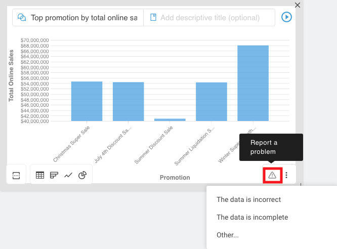
Selecting either of the first two options will report the problem automatically without providing additional context.
Select “other” to provide helpful context about the issue you are experiencing, then click Submit. Your feedback will be sent to our team for review.
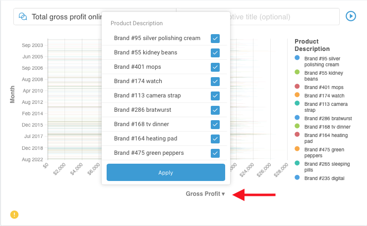
Show/Hide Columns
Click on the “eye” icon to show/hide columns. Opt to only display the columns in a table that contain the data most relevant for your unique purposes. To show or hide individual columns, select the “Show/Hide Columns” icon. Simply select which columns you would like to view and click “Apply”. .gif)
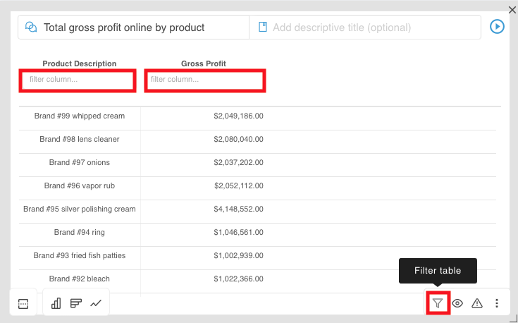
Filter Table
Filtering is a useful way to see only the data that you want returned/displayed. To filter a data response, select the “Filter” icon. Underneath each column header, you can filter by name, number, and enter criteria such as less than and greater than (</>) to filter numerical values.
More options
- View additional features/available actions by clicking on the triple dot icon in the toolbar menu on the far left-hand side.
Download as CSV
To download your result as a CSV file, select the “Download as a CSV” icon and open the CSV file on your computer.

Note: This feature is only available when viewing a data response in tabular format (not as a graphical response).
Copy Table to Clipboard
To copy a data response and move it to an external spreadsheet, presentation, report, or other, just select the “Copy to Clipboard” icon, and paste the data response into your desired spreadsheet or other location.
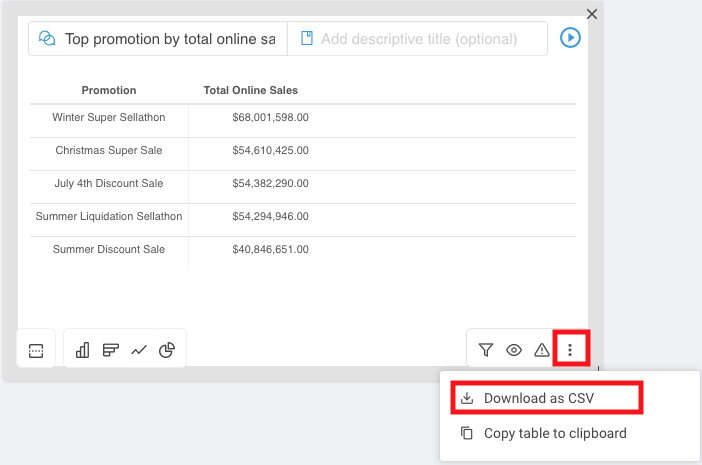
Note: This feature is only available when viewing a data response in tabular format (not as a graphical response).
Download as a PNG
To download your chart or graph as a PNG, select the “Download as a PNG” icon and open the PNG file on your computer.
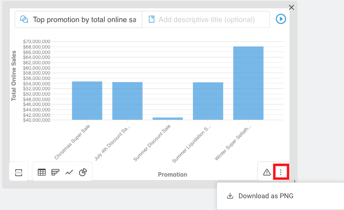
Note: This feature is only available when viewing a data response in graphical format (not as a tabular response).
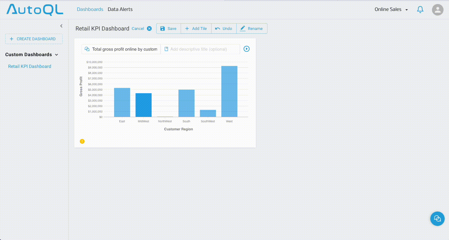
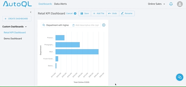
Adjust Axis Display
Once a data response has been returned, in some instances, you may notice a small arrow is present beside the x-axis or y-axis label.
If this arrow is present, this means the data being displayed on that axis can be adjusted.
Click on the arrow to view the different options that are available for you to display on that axis and select the one you would prefer to show.
Note: The Adjust Axis feature is only applicable under specific conditions. Due to how specific query responses can be graphed, this axis-adjusting functionality is only available when:
The query contains multiple groupables or filters AND
The selected data visualization type is a line chart, bar chart or column chart.
Drill Downs
When viewing a query result, there may be times where you wish to uncover the details underlying a given data point. To do so in Data Messenger, you can easily “drill down” to access these details.
What is a Drill Down?
To drill down means to surface or access a deeper level of information — or uncover the underlying details — that make up a given data point.
To drill down to access the details underlying a particular data point, enter a natural language query, receive the data response, and then simply click on a particular line item or detail in the graph or chart that is returned.
Note: When you click on a data point to drill down, an additional "drill down query" will be automatically generated from your action and a detailed response will be returned to you within seconds.
Split View
Dashboard Tiles can be split to show two separate display types for the same query response in tandem (e.g. show a horizontal bar graph followed by a table containing the same data). This feature allows the viewer to easily see information at-a-glance and share data stories more effectively.
Was this article helpful?